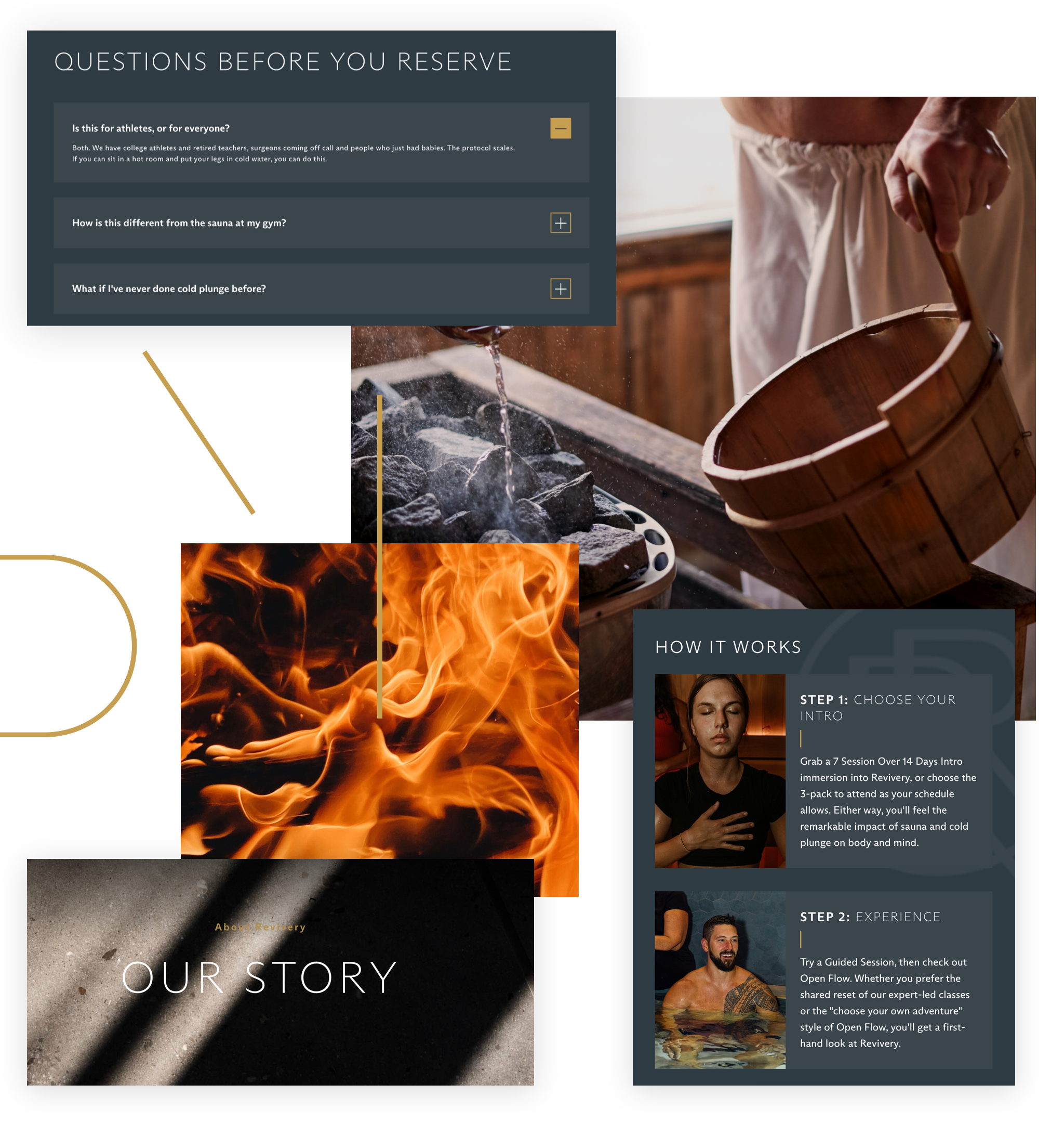
Revivery
BRAND EXPANSION WEB DESIGN
I worked on the Revivery brand and website as a part of the stellar team at Studio Simpatico. Revivery – a guided sauna and cold plunge company based in Tampa, FL – came to us with the beginnings of a brand, including colors, logo, and concepts they were using to build out their physical space.
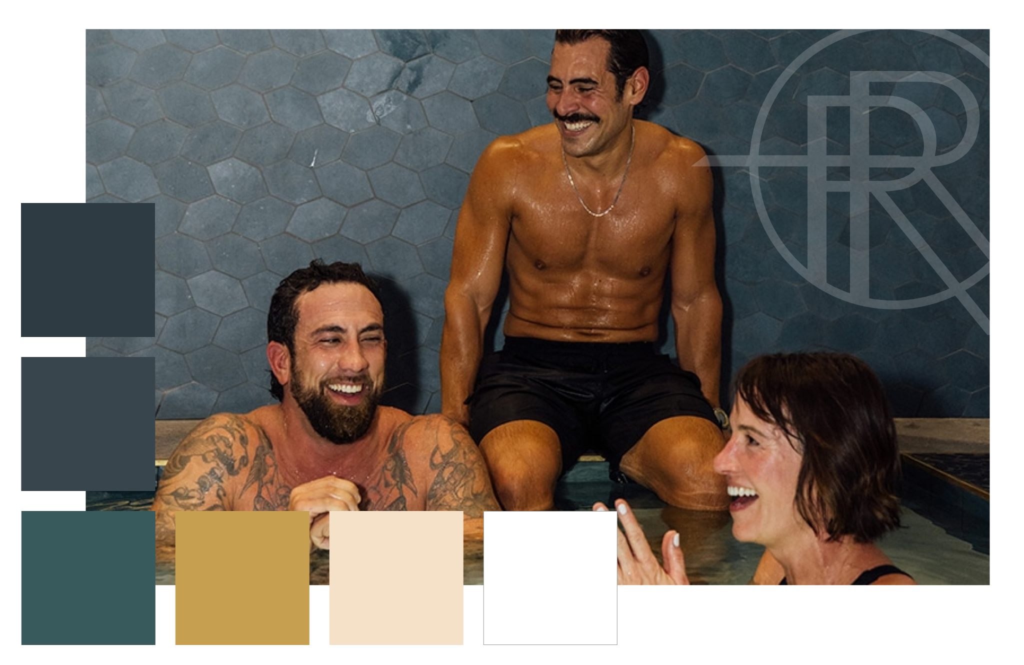
As design lead for this project, I worked with the team on diving deep into their business goals, visual references (and preferences), and existing branding toolkit. We adapted what existed already into a fully fleshed out visual identity, complete with guidelines on photo usage. We expanded their color palette from just a few hero colors to a complete palette of complementary colors.
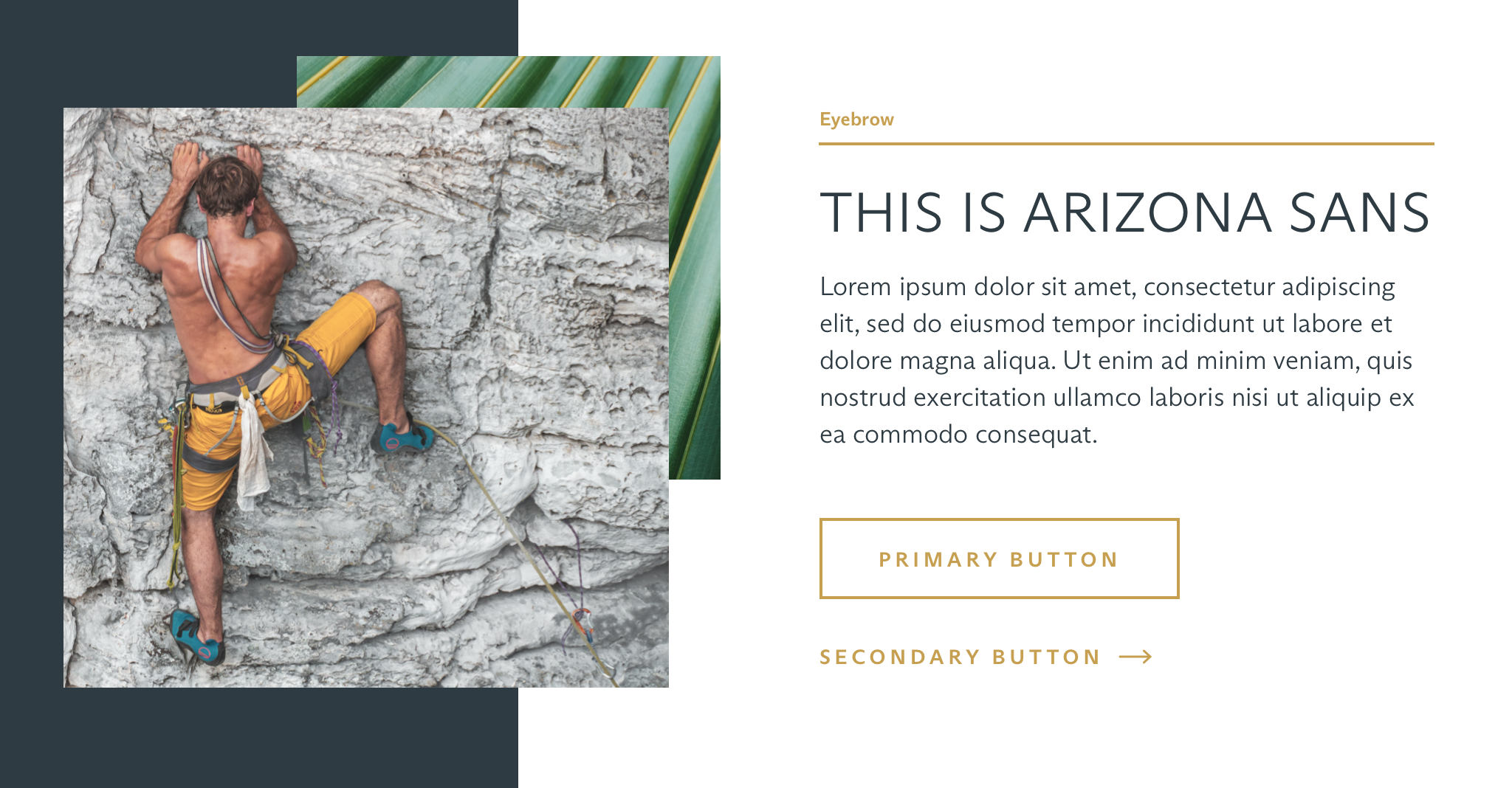
They came to us with their chosen font, Arizona, but without guidelines on how to use it and apply it in situ. So through our web design process, we nailed down how to apply the font in different locations – from the small gold eyebrow text set in bold to the tracked out all-caps headline using a lighter weight.
Design details like the thin gold lines sprinkled across the site brought the Revivery team’s affinity for the Japanese repair method of kintsugi to the forefront. The emphasis on dark colors and textured imagery reinforced the physicality of the experience of cold plunge and sauna.
Through our careful design choices, we were able to convey the heart of the Revivery brand – from their deep appreciation of the sauna tradition to the enthusiasm for wellness and fitness culture.
Check out their site at revivery.co, and give them a visit if you’re in Tampa!