
Pantry Diaries by Gabriella Stern
LOGO BRANDING
Gabriella Stern is a recipe developer, content creator, and food stylist with her own newsletter called the Pantry Diaries. She approached me to help her create a cohesive visual identity for her entrepreneurial work, from the newsletter to her website and – hopefully, as business grows – beyond!
Gabriella’s unique identity as a Jewish-Latina New Yorker has guided her work in the food world, leading her to cook up delicious recipes and write thoughtful stories about her heritage. She wanted to lean into these identities for her personal brand, also bringing in inspiration from her maternal grandmother’s small fruit business in Costa Rica and her paternal grandfather’s Jewish bakery in Yonkers.
I reviewed her inspiration materials, which included photographs of Costa Rica’s colors and fruits, ephemera from her grandfather’s bakery, and Gabriella’s own food styling work. I then synthesized these into two overarching design directions, which we ended up lightly combining to create the final version.
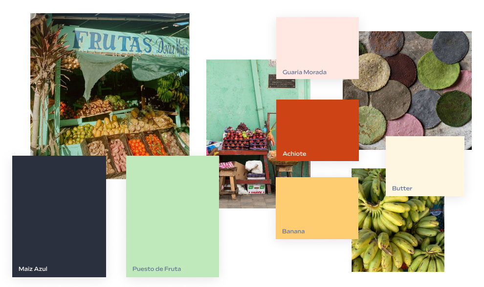
This visual identity is grounded in a color palette that brings together tropical fruit, the greatest city in the world, and the 1960s. A dark navy blue is reminiscent of both blue corn tortillas and the asphalt of NYC streets. A minty green brings in a popular color from the midcentury that was also present in Gabriella’s inspiration imagery of fruit stands – and is reminiscent of the green of a ripening banana. To balance these cool tones, a dusty pale pink and rusty red the color of achiote round out the palette. A buttery off-white acts as a neutral shade.
For fonts, I was lucky to be able to pull inspiration from actual documents that Gabriella’s family has from her grandfather’s New York bakery. This includes a business card and a full page flyer ad. Both feature a mix of classic typography from the mid-20th century, including geometric all-caps headline font in the veins of Futura and Franklin Gothic. I also looked at a lot of hand-painted signage references, since it is quite common in Latin America to use hand-painted signage rather than vinyl or other digital fabrication techniques.
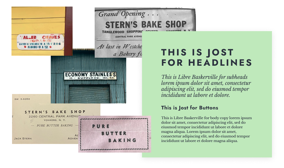
I decided to mirror some of these type choices for Gabriella’s brand fonts, and chose Jost as the headline font, set with wide spacing and all caps. I paired it with Libre Baskerville as the secondary font, both for subheads in italics and as the paragraph font. The italics soften the boldness of the headlines, and this pairing is also a direct reference to Stern Bakery’s original type choices.
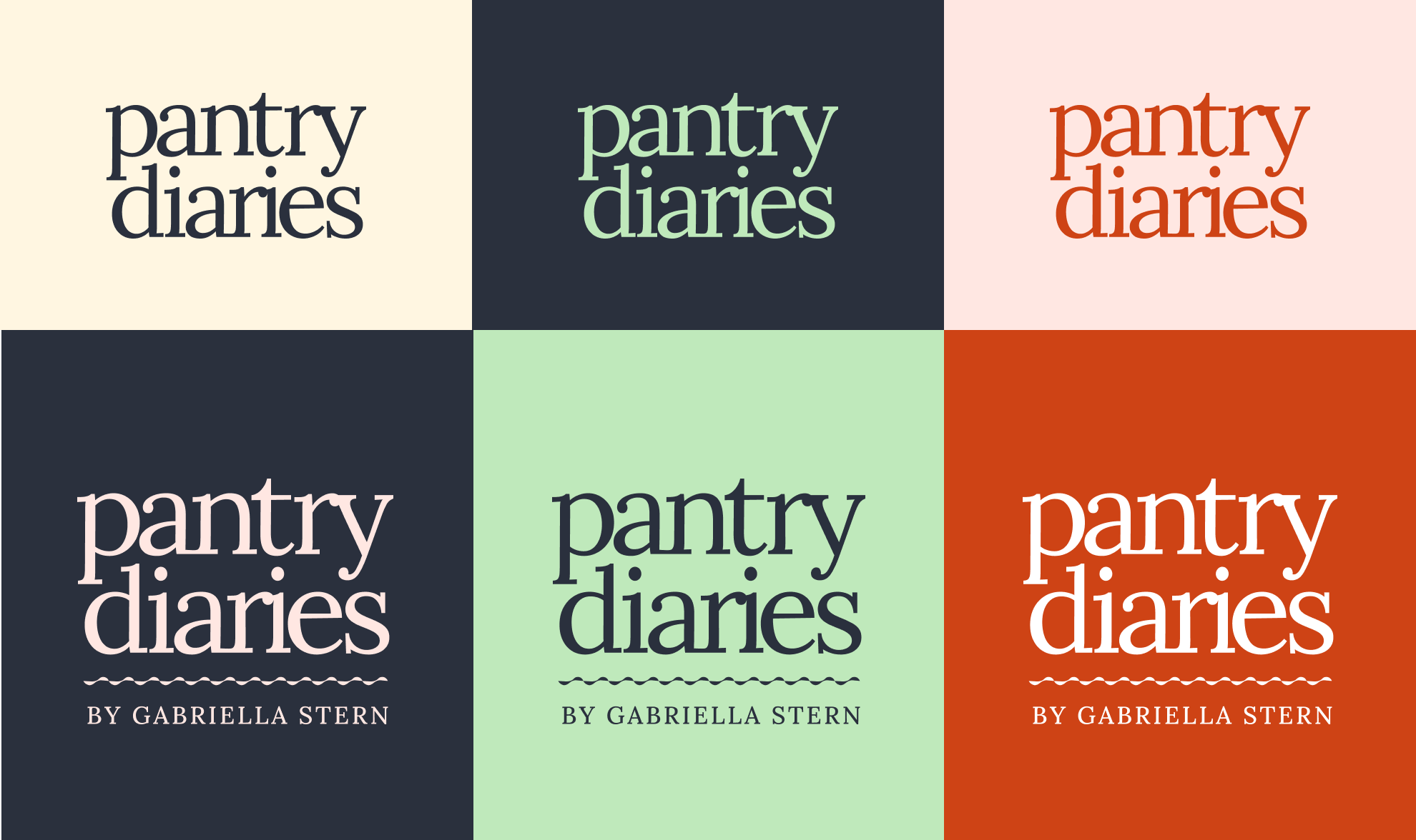
As part of the engagement, Gabriella also wanted a new logo for her newsletter, the Pantry Diaries. I sought references from period gourmet magazine logos, as well as midcentury logos like Bloomingdales to bring in a sense of playfulness. We ended up choosing an all lowercase lockup using Lora, with custom adjustments to allow for a more tightly spaced setting.
Additionally, I brought in another element from her grandfather’s bakery, a whimsical squiggle border that can be incorporated into the logo when used at a larger size, or used as a dividing graphic element across her brand’s ecosystem.