Big Green
BRANDING WEB DESIGN
Big Green is a national nonprofit working to improving education around how to grow a garden and increasing access to the necessary tools. They approached us at Studio Simpatico for help with a completely new website.
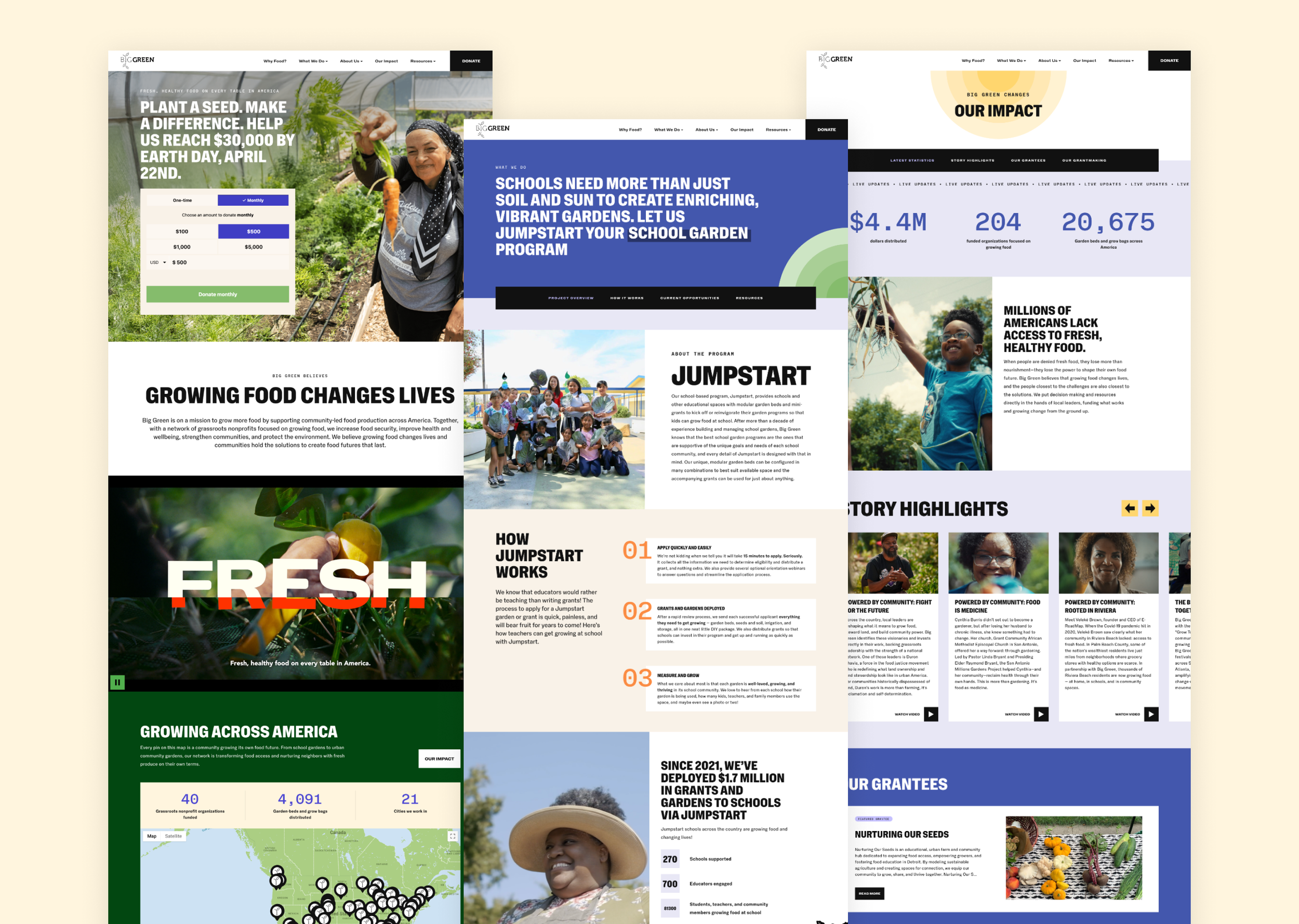
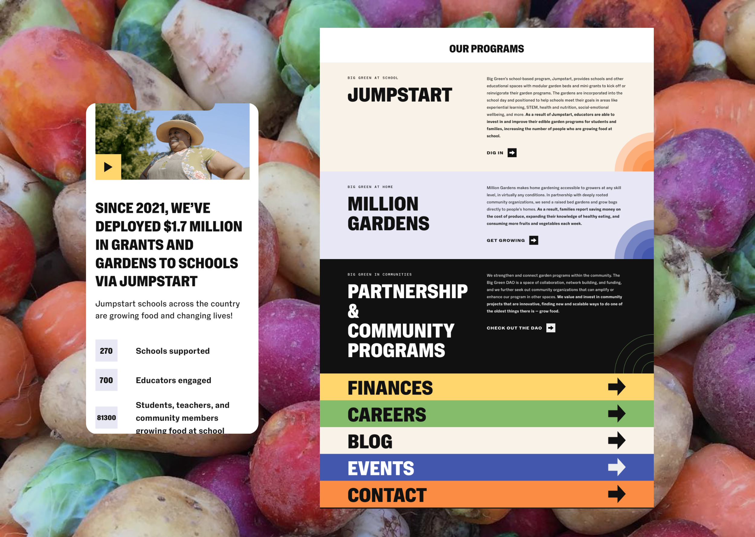
I led visual design for this project, from the concept work and visual directions, to the design of each individual page. I chose NaN’s Holo Condensed font in all caps as the new headline font across the site, which added an offbeat, bold, and characterful feeling to the site. A new color palette of punchy, organic-feeling shades softened the boldness of the font and brought to mind fresh vegetables like carrots, spinach, and sungold tomatoes.
To pair with these elements, our studio illustrator created bold silhouette-based illustrations with a textured feeling that further balanced the large blocks of color on the site, and we created a parallax effect so that when the user scrolls, the vegetable illustrations follow them down the page. The final element of the visual look is the animated sunbursts that peek out from the corners of the site, popping out to add contrast and visual interest, and lending a sense of fun and youthfulness to the organization.